Parodies of Life, Part 1: 1937-1945

Fake Life Begins: Early parodies from Penn State (top), Missouri (below) and Penn (right)

(Date – Parody By: “Parody Title,” Length.)

  • January 1937 – Penn State Froth: “Froth,” 1 page + front cover.
  • January 1937 – USC Wampus: “How to Reduce” (article from “Strife”), USC Wampus, 2p.
  • February 1937 – Missouri Showme: “Strife,” 24p + 4c.
  • April 23, 1937 – Pennsylvania Punch Bowl: “Punch Bowl’s Life,” 56p + 4c.
  • April 23, 1938 – The New Yorker: “The Birth of an Adult” (article), 2p.
  • January 1939 – Penn State Froth: “Life Goes to a Froth Party” (article), 1p.
  • November 1939 – Wisconsin Octopus: “Life Discloses The Happy Weekend of a Wisconsin Coed” (article), 1p.
  • December 13, 1940 – U.S. Naval Academy Log: “Log,” 64p + 4c.
  • March 5, 1941 – Ohio State Sundial: “Life Comes to Ohio State” (article), 2p.
  • May 5, 1941 – Michigan Gargoyle: “Garg,” 52p.
  • October 25, 1941 – The New Yorker: “Life Goes to the Collapse of Western Civilization” (article), 3p.
  • January 1942 – Stanford Chaparral: “…How to Tell an L.Y.B. from a Chinese” (article), 0.67p.
  • May 20, 1942 – Yale Record: “The Record Goes to Wartime Yale” (article), 5p.
  • October 1942 – Penn State Froth: “Life Goes to Penn State” (article), 2p.
  • May 1943 – Stanford Chaparral: “Like,” 32p + 4c.
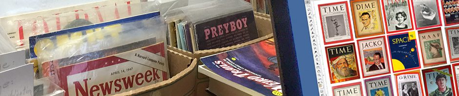
  • September 30, 1943 – Merced Army Air Field Flight Lines: “MAAF,” 44p + 4c.
  • Fall 1943 — German Ministry of Propaganda, “Life/Life?” (leaflet/poster), 8p on 2.
  • February 25, 1944 – U.S. Naval Academy Log: “Log,” 56p + 4c.
  • Fall 1944 — German Ministry of Propaganda, “Life/Death” (leaflet), 2p.
  • February 23, 1945 – U.S. Naval Academy Log: “Log,” 44p + 4c.
Luce by Will Cotton,
The New Yorker, 1936

The most famous parody Life inspired wasn’t a parody of Life. The first issue of Time Inc.’s picture weekly was still on the stands in 1936 when The New Yorker published Wolcott Gibbs’s Profile of publisher Henry R. Luce. Written entirely in backward-running, multi-adjectived early Timestyle, “Time … Fortune … Life … Luce” exposed the inner workings of man and mags in intimate detail, memorably ending, “Where it all will end, knows God!” Luce suspected the story might be payback for a similar vivisection of The New Yorker in Fortune two years earlier, but he cooperated to promote Life. He was furious when New Yorker editor Harold Ross showed him an advance copy, and when Luce was furious, he stuttered.

“Goddamn it, Ross, this whole goddamned piece is ma-ma-malicious, and you know it!” he said when the two sides met at Ross’s apartment just before publication.

“You’ve put your finger on it, Luce,” Ross replied; “I believe in malice.”

Luce could have spared himself the heartburn. With or without The New Yorker’s blessing, Life was going to be a hit. The development of sharper, smaller cameras in the early ’30s had sparked a boom in candid news photos and inspired successful large-format picture weeklies in Europe. For Time Inc., which was already exploring photojournalism in Fortune and The March of Time, it was a natural next step.

Early on, in-house experts projected Life might sell 250,000 copies a week, total; it reached 235,000 in advance subscriptions alone. When the first issue went on sale on November 19, 1936, the Thursday before the cover date, all 200,000 newsstand copies disappeared that day. “The demand for Life is completely without precedent in publishing history,” circulation manager Pierre Prentice wrote, “There is no way we could anticipate a bigger newsstand business in the first month than magazines like Collier’s and Satevepost have built up in thirty years.” By the end of its first year, Life’s circulation was 1.5 million; six months later it passed 2 million. 

Success spawned imitators and parodists. The commercial ripoffs favored cheap paper and punchy titles like Click, Pic, Spot and Dash. Most were “edited with the viewpoint of a circus sideshow – heavy on cheesecake and the freakish,” Robert Elson wrote in Time Inc.’s official history. (Only Gardner Cowles’s Look lasted, and it was in the works before Life debuted.) Life-like photo spreads began to appear in annual reports and house organs, and picture magazines sprang up on campuses from UCLA to Dartmouth. College humor mags added photo pages; at least one, the M.I.T. Voo Doo, changed its whole personality: “It is no longer primarily a humor magazine, . . . because college humor magazines in general are a mistake,” school paper The Tech sniffed in May 1939. “The substitute . . . bears a resemblance to the magazine, Life, but it is a well done resemblance, and does the resembler credit.” Fortunately, the comic spirit proved unkillable, and Voo Doo was soon its discreditable old self.

“How to Reduce,” from “Strife,” USC Wampus, 1937

The Southern Cal Wampus and Penn State Froth pounced on Life at once, getting brief spoofs into parody issues already scheduled for January 1937. Froth was first to run a fake Life cover, but the first issue-length takeoffs were the Missouri Showme’s “Strife” in February and “Punch Bowl’s Life” at Penn in April. Their haphazard layouts and tiny photos look crude now — they looked crude then — but they’re only slightly worse than some of the real thing’s early pages.

Suggestive cover hides solid reporting in the Michigan Gargoyle’s “Garg,” 1941.

Like Punch Bowl’s, most college “Lifes” were less parodies than small-scale emulations, set in a world that ended at the campus gates. Some had so much fun pretending to be Life they neglected to make fun of it: “Strife’s” headline calling nearby Stephens College for women “A Shining Pearl in U.S. Educational Diadem” isn’t sarcasm but the intro to a five-page puff-piece. The Michigan  Gargoyle’s “Garg” raised eyebrows in 1941 with its open-throated cover girl, but the lead story on a campus antiwar rally is straight reporting, as is most of what follows. Other emulations mixed factual local features with spoofs of the outside world. A few dispensed with jokes entirely — an understandable decision for the Naval Academy Log in 1944 and ’45, if not for a civilian comic in peacetime.

Three Life-like Navy Logs
The Annapolis Log as Life in 1940, ’44 and ’45

Students who had seen the story-making machinery up close were less respectful. After visits from Life crews in 1939-42, the humor mags at Wisconsin, Ohio State and Yale all mocked them for missing the dullness and/or debauchery behind the ivy-covered facades. The Yale Record was confident enough to send its five-page spoof to press weeks before “Yale at War” appeared in Life’s June 6, 1942, issue: The creators badly overestimated the number of swimsuits the real story would display. But such cynics were exceptions: Life wanted be liked, and in the ’30s and ’40s it was often copied but seldom mocked.

The Yale Record’s preview of Life’s view of Yale; right: Life’s “Yale at War”

Except at The New Yorker. Relations had started badly in 1925, when two-year-old Time panned The New Yorker’s first issue. They grew worse after Ross’s right-hand man Ralph Ingersoll defected to Luce and aired Eustice Tilley’s underthings in Fortune. (The story ran without a byline, but all concerned knew.) History aside, the understated, unflappable New Yorker and bubbly cheerleader Life were never going to be besties. In 1938, when Life made headlines and risked bans with four pages of stills from an educational film on childbirth, The New Yorker’s E.B. White and Carl Rose responded with “The Birth of an Adult.” One key to maturity, they insisted, was giving up pablum like Life. An early-’40s Garrett Price cartoon was more succinct: “Is it okay, Joe,” one ad copywriter asks another under a wall of Life covers, “to refer to our subscribers as readers?”

From “The Birth of a Adult,” The New Yorker, 1938

The harshest blow was “Life Goes to the Collapse of Western Civilization,” by Russell Maloney and Rea Irwin. Published shortly before Pearl Harbor, the three-page pictorial leeringly followed two attractive models around Manhattan as New York fell to Axis invaders. “Harold Ross, always glad to tweak what he considered the pomposity of Luce and his magazines, took note of Life’s simultaneous fascination with ‘pretty women’ and its doomsday fantasies as it attempted to prepare its readers for war,” Alan Brinkley wrote in his biography of Luce. “Luce had reacted to The New Yorker’s satirical 1936 profile of him with almost violent fury. But by 1941 he was so deeply immersed in the cause of the Allies that he gave The New Yorker, and his other critics, virtually no notice at all.” 

“Life” during wartime: The New Yorker, 1941

Life’s first issue after the U.S. entered World War II contained one its most embarrassing editorial missteps: a two-page primer on (literal) racial discrimination called “How to Tell Japs From the Chinese” (Dec. 22, 1941). The Stanford Chaparral responded in January 1942, pushing Life’s loaded adjectives and wispy distinctions to absurdity in “How To Tell an L.Y.B. From a Chinese.” Its casual use of racist language to express anti-racist sentiments wouldn’t fly today, but it’s a time capsule of Stanford’s mood in the months between Pearl Harbor and the internment orders, when a thirst for vengeance against Japan mixed with concern for the feelings and safety of Japanese-American fellow students (of whom there were around 30 at Stanford in 1941-42). Significantly, though the issue is called the “L.Y.B. Number,” the phrase “little yellow bastards” never appears, and the writing steers away from the kind of vituperation mocked in “How To Tell… .” (The cartoons are a different story, as usual.)

Life’s 1941 how-to and the Chaparral’s rejoinder; 1943’s “Japanazi”

Chappie’s “Like” in May 1943 also wobbled between crudity and restraint. The face on the cover is the standard buck-toothed, four-eyed stereotype (though in a German helmet), but the story inside says nothing about the physical appearance or innate viciousness of the enemy “Japanazis.” The battle to oust them from a bridge in nearby Vallejo is a bloodless romp that only ensures “a quarter million free Luckies . . . reached our Boys overseas.” Other stories put comic spins on favorite Life subjects — the brilliant thinker who sounds like an idiot, the apple-cheeked teenager dating a drag racer — all of them located in and around Palo Alto.

The longest passage in “Like” that sounds even half sincere is an editorial regretting the “brilliant” idea of creating it in the first place: “This required changing our usual page sizes and make-up and produced general chaos and upheaval . . . . Not the least of our worries was the taking of the numerous pictures . . . [which] requires more time than filling a space of equal size with type.” The Chaparral wasn’t alone in finding Life hard to copy: Only the most meticulous editors had the time or skill to match its trademark squared-off text blocks and photo captions, which always ended with a full line of type.

Future pilots in the Merced Army Air Field Flight Lines’s “MAAF,” 1943

Life’s war coverage pushed its circulation past 5 million and made it a worldwide symbol of U.S. power and influence. The staff of Flight Lines magazine at the Merced Army Air Field in California borrowed some of that glamor for its September 1943 cadet class book, using Life’s format to show that pilot trainees “do occasionally leave their work . . . to eat, to talk . . . to keep up on the events of the world and the war . . . or just to relax.” Opposite a fake ad inviting graduates to “See Scenic Germany — While It’s Still There,” the editors ran a letter from the real Life giving permission for the parody, as long as it didn’t have “a very close imitation of Life’s cover … [or] the word Life in a box as we use it … so there is no possibility of confusion.”

1943 Life (to scale) with Axis poster (folded and unfolded) and two “Life/Death” cards

The memo didn’t reach German propagandists who dropped an eight-page leaflet/poster on U.S. air bases in East Anglia that same fall. “The front page was an actual reproduction of [the cover of] the true Life issue for July 26, 1943, with pictures of 8th Air Force crews,” R.G. Auckland and Kenneth B. Moore wrote in Messages from the Sky over Britain (London: Psywar Society, 1998), “but the remaining seven pages showed gruesome and horrifying pictures of aircrews who had been killed over Germany, together with many speeches, reports and quotations on the subject of the air bombing of the Third Reich. . . . No mention of the incident appeared in the contemporary national press.” (The whole gory thing can be seen at imgur.com/a/Y2w6u.) A few months after D-Day, postcard-size “Life” covers dated October and November 1944 cropped up in Italy: One one side, a nude woman posed under the familiar logo; on the other, a skull in an army helmet hovered between the red-boxed word “Death” and the date “Doomsday 1944.” At least six different photos were used on the nude side, while the skull alternated between British and American headgear.

“Though we did not plan Life as a war magazine, it turned out that way,” Luce once said. But while the World War II years were Life’s greatest era, the late ’40s and ’50s were its grandest. It was then that parodists outside The New Yorker turned their sights on Life itself, mocking not just the things it covered but the way it covered them. They’ll be the subjects of my next post. — VCR

The New Yorker’s “Paunch,” 1934

Punch and Paunch covers

The covers of Punch for August 30, 1933, and The New Yorker’s 1934 parody.

Parody Of: Punch. Title: “Paunch.” In: The New Yorker, January 13, 1934, pp. 17-24. By: Thurber, Benchley, White, Irvin, etc. Availability: Sometimes findable on eBay, Abebooks, etc.; archived online at newyorker.com (subscription required).

January 13, 1934, New Yorker cover

TNY, 1/13/34

“By humorous [art] we do not mean comic stuff, captioned by a wisecrack, no custard-pie slapstick stuff,” Harold Ross wrote potential contributors to the brand new New Yorker in 1925. “We want our things to be humorous from a sophisticated viewpoint. . . . We want to record the situations of everyday life among intelligent and substantial people as do the English magazines, notably Punch, except that our bent is more satirical, sharper.” How much sharper can be seen in the January 13, 1934, issue, which devoted eight pages to “Paunch,” The New Yorker’s longest and most elaborate parody of another publication.

And about the only. E.B. White created a double-page spoof of Manhattan newspaper features for the November 17, 1928, issue that looks like a collage of clippings from the originals. Just weeks before Pearl Harbor, Russell Maloney and Rea Irvin linked two of Time Inc.’s favorite subjects — cheesecake and catastrophe — in a black-humored, three-page “photo” essay called “Life Goes To The Collapse of Western Civilization” (Oct. 25, 1941). Otherwise, The New Yorker’s parodies — even Wolcott Gibbs’s famous Profile of Henry Luce in Time-style (“Time . . . Fortune . . . Life . . . Luce,” Nov. 28, 1936) — look like pages of The New Yorker.

Three other New Yorker parodies

First pages of The New Yorker’s spoofs of newspaper features (1928), Time (1936) and Life (1941).

“Paunch” appeared when the real Punch was at low ebb, a plight most critics blamed on Sir Owen Seaman, its editor from 1906 to 1932. Seaman’s morale-boosting during the First World War burnished Punch’s image, but he was a Victorian by temperament and no fan of the slangy, quick-witted, disrespectful and often absurd humor of the Roaring Twenties. “He did not see Punch as an organism or plan ahead, looking to see the way humor was changing, learning from successes and failures in the past,” R.G.G. Price says in A History of Punch (Collins, 1957). “He saw Punch as a National Institution and about as liable to change as the Nelson column. Its function was to act as a fixed point for a bemused public until a normal condition of stasis was resumed.” In practice, this meant freezing Punch’s cover in 1847, its layout in the 1860s and its prejudices in 1897 (the year Seaman joined the staff). Price, a longtime Punch insider, tries to accentuate the positive in his semi-official history, but his account of Seaman’s last decade is damning:

It is difficult now [1957] to realize the hysteria with which Punch was reviled in this period and beyond. . . . It was not even wholeheartedly on the side of reaction. It was tolerant, avuncular and patronizing. Criticism came from Right and Left, though every attack on class changes, Americanization of English speech, modern art or the modern girl was received with clucks of approval in hunting lodge and rectory and in the sad sitting rooms where daughters of military men gave music lessons. . . .

[Seaman’s] Punch has an air, at times, of providing jokes for those who found joking difficult. . . . The more one thinks about this policy the odder it seems. For a humorous periodical to be aimed at the unhumorous was as absurd as for a musical periodical to be aimed at the tone-deaf, but it is quite clear, by the tone of the correspondence from some of the older readers. . . that Seaman’s Punch did arouse a frenzied and deadly loyalty among bores, the naive and the prematurely old. [A History of Punch, p. 225-9]

Seaman reluctantly handed the editorship over to E.V. Lucas at the end of 1932, but “Evoi,” as he signed his Punch work, was no revolutionary. The Punch mocked in “Paunch” was essentially Seaman’s, and it showed all of its 93 years.

"Two pages from "Paunch"

“Paunch” teased Punch’s obesessions with Hollywood films and gangland Chicago in “Charivaria;” James Thurber’s “Beast” and Franklin P. Adams’s “Caterpillar” mocked its prose and verse.

The New Yorker, on the other hand, was at the top of its game in 1934. Its circulation was around 125,000 and climbing, and in the six months from January through June it ran more ad pages than the Saturday Evening Post, which had led the field for decades. Its original rivals, Judge and the pre-Time Inc. Life, were dying, and Norman Anthony’s lowbrow Ballyhoo wasn’t in the same class. The New Yorker’s masthead featured — or would have featured, if it existed — James Thurber, Robert Benchley, Franklin P. Adams and Ring Lardner in addition to White, Gibbs and Irvin. All contributed to “Paunch,” infusing it with more A-list comic talent per square inch than any other parody in history. (Citation needed.)

Belcher cartoon and parody

Cartoonist George Belcher in Punch (left) and in Rea Irvin’s parody.

The New Yorker didn’t trumpet “Paunch’s” authors at the time, but its online index says Thurber wrote “The Happier Beast,” a sendup of the cozy woolgathering that subbed for wit in too many “light” essays. Benchley downshifted his usual befuddled persona into complete ninnyhood for a featherweight dialogue called “Hyacinths for Pamela.” Gibbs, The New Yorker’s film critic, aped English insularity in “Mr. Paunch’s Cinema Review.” “The Mall,” by White, and “The Intent Caterpillar,” by Adams, nailed two of Punch’s favorite forms of bad verse: the sticky-sentimental and the mechanically clever. Uncredited newsbreaks and fake ads sent up Punch’s long-winded quips, its fixations on Chicago gangsters and Hollywood films, and — most hilariously — its tin-eared attempts at American slang. Though “Paunch” wasn’t promoted on the cover, the issue it ran in became the first in The New Yorker’s nine-year history to sell out on newsstands. (The second sellout contained Gibbs’s Time parody, which suggests a demand for such things.)

Two images from "Paunch"

Thurber’s “Laocoon;” Yanks imitating Brits imitating Yanks in a fake ad.

Irvin did most of the drawings, moving from elaborate crowquill to charcoal in the styles of Bernard Partridge, E.H. Shepard, George Belcher and others. The ringer is Thurber’s “Laocoon,” a spoof of Punch’s fondness for allegorical political cartoons based on classical myths. Nothing like Thurber’s doughy men and garden-hose snake would have appeared in the real Punch of the time, which may be the point: It’s a deliberate wrong note played outside Punch’s narrow range of “good” cartooning.

Punch's 1954 New Yorker parody

Revenge, served cold

“Perhaps because of its nearness to the original, this parody was not received with much merriment in the Punch office,” R.E. Williams understates in A Century of Punch Cartoons (Simon & Schuster, 1954), “but when the magazine wholesalers phoned in to ask if they would be sued for libel if they handled the issue, the answer was a dignified negative.” Revenge came years later in the form of another parody, also eight pages, in the April 7, 1954, issue of Punch, called “The N*w Y*rk*r.” It sold out, too. — VCR

Wisconsin Octopus Parodies, 1920-1959

Six Octopus parodies.

The Magazine

Before The Onion, the most famous humor magazine to come out of Madison was the University of Wisconsin Octopus, b. November 1919, d. 1959, after UW officials found the May issue so offensive they extinguished the title. The editors did ask for it: On one page they reproduced an official warning to quit printing smut like the previous issue; on the others they parodied Playboy. The cover of “Blayboy” — a takeoff on Playboy’s for the same month — showed the mag’s eight-handed mascot joining three startled young ladies in a bubble bath. Bye bye, Octy.

Covers of Playboy and parody

Though they shared a cover date, Playboy’s May issue came out several weeks before Octy’s “Blayboy.” Right: Official displeasure

Sixty years on, Wisconsin seems willing to forgive and remember: There are now 281 Octopus issues in the UW Digital Collection, where they can be read by just anybody. “Blayboy” is represented only by a cover and its smutty predecessor is missing entirely, but most of the rest are on hand. Rather than link to individual issues, here’s the whole set.

First Octopus cover

Vol. 1, no. 1

Octy was UW’s third humor magazine, following the Sphinx (1899-1913) — also online, though I haven’t found any parody issues — and the short-lived Awk (1915-1917). It was started privately by three students who turned it over to the school after two profitable issues. The U. mostly left it alone, though a “risque cartoon” in 1928 “led for a time to a closer review of all material by the faculty majority on the Octy board of directors,” says UW’s official history. Despite vowing in its first editorial to make “no attempt to issue numbers regularly,” Octy appeared eight to ten times a year for 23 years before pausing for World War II. Its return in 1946 was misnumbered Vol. 25, an error never corrected.

1939's one-page Life spoof

Spoofing Life, 1939

Octy flourished in the ’20s. The history tells of “glossy, quarto-sized issues running as many as sixty-four pages, colored covers, clever cartoons and graphics by student artists, and humorous prose and poetry.” At the depth of the Depression issues shrank to sixteen pages and the price fell from a quarter to a dime, but for most of the ’30s Octy was “a handsome, professional-looking magazine, better in design that most of its peers, and nearly as attractive as Vanity Fair or [The] New Yorker, on both of whom it had a noticable crush,” according to uwalumni.com. It ranked high in college humor polls and sometimes addressed serious subjects: A 1938 story by future New York Times reporter Leonard Silk exposed the Fascist leanings of a new Wisconsin-based third party called the National Progressives, and in 1939 the mag ridiculed the DAR for not allowing Marian Anderson to sing at Independence Hall.

The first sign of postwar trouble was a nearly year-long gap after the December 1951 issue. When the mag reappeared in November 1952 it was briefly called The New Octopus, though editor Ken Eichenbaum joked(?) that it looked “so damn much like the old one that six of us have decided to hang it up and transfer to Marquette.” He didn’t even mention the long hiatus. Octy retrenched to six issues a year, briefly tried a “more mature” policy and hit the financial rocks in 1955-56. “Too many students are READING the Octy without BUYING it,” grumbled an ad in the May 1956 issue, which begged for a thousand students to pledge — “NOW!” — to subscribe next fall. They didn’t, and Octy vanished for three semesters, reappearing with three issues in spring 1958 and three more in ’58-59. The last twitch was an undated reprint collection the next year that failed to spark a fourth revival. Three decades would pass before UW produced another nationally known humor rag.

1951 DailyCardinal parody

Cover and three inside pages from Octy’s 1953 “Daily Cardinal” issue

II: The Parodies

Octy's 1920 "Vie Parisienne" cover.

May 1920

Though it modeled a cover on France’s racy La Vie Parisienne its first year, Octy produced few parodies before the 1930s and only about two dozen total. Nearly half were of the student newspaper, always impersonated under its real name: the Daily Cardinal. Most Cardinal parodies appeared as magazine pages on authentic (and cheaper) newsprint, though in 1953 a tabloid was printed separately and folded into the March number. (Such inserts tend to stray; the UWDC has the mag but no paper.) Octy’s “Cardinals” were dryer and funnier than most such efforts and not afraid to razz local heavyweights, including Wisconsin’s junior U.S. Senator from 1947 to 1957, Joe McCarthy.

Covers of Chicago Tribune and Time parodies

The Tribune was Octy’s only off-campus newspaper target, Time the only magazine hit twice.

Octy’s first big parodee was the Police Gazette, traditional reading matter of barber shops and saloons. It was a relic of grandpa’s day even in 1929, but the Bootleg Era saw the 1890s the way later generations saw the ’20s: as the last time people knew how to have fun. This foolery was followed by a jaundiced look at Hearst’s jingoistic Sunday magazine The American Weekly in 1935 and an even sharper mauling of the arch-Republican Chicago Tribune in ’38, cowritten by Leonard Silk. Octy didn’t attempt a cover-to-cover parody until 1949, when it put Republican Gov. Oscar Rennebohm, a very dark horse in the 1952 presidential stakes, inside the red borders of “Timf.” After that, parodies came out almost annually.

Pages from Octy's Life parody

Collegiate whimsey meets Korea and custom cars in Octy’s “Liff,” 1953

The 1949 Badger yearbook called “Timf” the magazine’s “best post-war issue” and claimed it outsold the Daily Cardinal. The 1950 edition called “The Old Yorker” “the editorial and financial high point of the year.” My choice for best mock Oc is 1953’s “Liff.” Too many college parodists were content to focus Life’s wide-ranging lens on their own anthills and play the findings relatively straight; Octy highjacked the format to satirize Hollywood movies, Congressional hearings, cheesecake photos and Life itsef: “We do not believe in slanting words or pictures,” the lead editorial declared. “People look too thin that way.” Even the Korean stalemate was played for laughs in the “war memoirs” of a male-turned-female photographer named after Marguerite Higgins but inspired by Christine (née George) Jorgensen, who in early 1953 was as famous as Mamie Eisenhower.

Real 1950 Flair cover

Flair, Feb. 1950

Octy’s oddest parody was “Flare,” a sendup of Flair. The brainchild of Fleur Cowles, wife of Look publisher Garnder Cowles, Flair was a lavish monthly blend of heavyweight bylines, trendy arts coverage and innovative graphic design, featuring pekaboo covers, half-size and translucent pages, bound-in booklets and accordion foldouts. It appeared for exactly one year starting February 1950 and was four months dead when “Flare” appeared in May 1951. Two years later, a parody of campus mag The Wisconsin Idea coincided with the real thing’s last issue. Thereafter Octy picked sturdier targets: Life, Mademoiselle, Time again (with Athletic Director Ivan B. Williamson on the cover) and, fatally, Playboy.

Octopus Parodies of the Wisconsin Daily Cardinal, 1932-1958:

(Issues are listed by volume and number in the Digital Collection, so I’ve included that.)

  • The Daily Cardinal, Vol. 13, no. 6, Feb. 1932 (16 pages + 1 cover)
  • —–, Vol. 15, no. 6, Feb. 1934  (18, some with real ads)
  • —–, Vol. 18, no. 6, Feb. 1937  (13, inc. 3-page “Collegiate Digest” photo section)
  • —–, Vol. 20, no. 8, April 1939 (4)
  • —–, Vol. 22, no. 3, Nov. 1941 (4)
  • —–, Vol. 25, no.6, Feb. 1947 (4)
  • —–, Vol. 26, no. 6, Feb. 1948 (8 + 1c)
  • —–, Vol. 27, no.7, March 1949 (8 + 1c)
  • —–, Vol. 28, no. 3, Nov. 1949 (8 + 1c)
  • —–, Vol. 29, no. 5, Feb.-March 1951 (8, called “1950 [1951]” online)
  • —–, Vol. 31, no. 4, March 1953 (insert, not online)
  • —–, (“Tri-Weakly Cardinal”), Vol. 32, no. 5, March 1954 (8)
  • —–, Summer 1958 (4, tabloid)

Other Octopus Parodies, 1920-1959:

  • La Vie Parisienne (“La Vie Wisconsienne”), Vol. 1, no. 5, May 1920 (cover only)
  • Police Gazette, Vol. 11, no. 1, September 25, 1929 (16 + 1c)
  • American Weekly (“American Weakly”), Vol. 17, no. 4, Dec. 1935 (10) (called “Vol. 15 [17]” online)
  • Chicago Daily Tribune, Vol. 20. no. 4, December 1938 (4)
  • Life (article: “Life Discloses the Happy Weekend of a Wisconsin Coed”), Vol. 21, no. 3, Nov. 1939 (1)
  • Time (“Timf”), Vol. 27, no. 5, Jan. 18, 1949 (44 + 4c)
  • The New Yorker (“The Old Yorker”), Vol. 28, no. 8, April 1950 (40 + 4c)
  • Flair (“Flare”), Vol. 29, no. 7, May 1951 (36 + 4c)
  • The Wisconsin Idea (“The Wisconsin Idear”), Vol. 31, no. 4, March 1953 (10)
  • Life (“Liff”), Vol. 31, no. 5, April 1953 (40 + 4c)
  • Mademoiselle (“Madmoiselle … and the Arts”), Vol. 33, no. 2, Dec. 1954, (28 + 4c)
  • Time (“Tum”), Vol. 34, no. 4, Feb. 1956 (28 + 4c)
  • Playboy (“Blayboy”), May 1959 (not online)

Sources:

E. David Cronon and John W. Jenkins. The University of Wisconsin: A History: Volume III: Politics, Depression, and War, 1925-1945 (U. of Wisconsin Press, 1994), pp 626-629.

Matt Rogge. “Through the Eyes of the Octopus,” uwalumni.com, posted July 12, 2017.

— VCR

Corey Ford’s “Mis-Fortune,” 1934

Corey Ford's Misfortune

Parody Of: Fortune. Title: “Mis-Fortune.” In: Vanity Fair, March 1934, pp. 22-23, 62.
By: “John Riddell” (Corey Ford).  Availability: Findable; usually pricey.

March 1934 Vanity Fair cover

Dwight Macdonald dismissed Corey Ford’s parodies as “mild” and didn’t include him in his magisterial Parodies: An Anthology from Chaucer to Beerbohm – And After (Random House, 1960). I’m hesitant to disagree with Macdonald — his book is merely the best thing ever done on the topic of literary parody — but he was strict grader, and Ford was something of a class clown: Like Mad a generation later, he had no qualms about putting authors in their own universes or breaking the fourth wall for the sake of a joke.

Ford went directly from Columbia University, where he edited the Jester and (therefore?) didn’t graduate, to the pages of Life, Judge and, especially, the old Vanity Fair. From the late ’20s until VF’s demise in 1936, he was in nearly every issue with a feature, profile or “Impossible Interview,” the last illustrated by the great Miguel Covarrubias. Meanwhile, his alter ego “John Riddell” wrote a monthly parody — usually of a recent bestseller, but every now and then of a magazine. Before tackling Fortune, he spoofed Time as “Time-and-a-Half” in March 1933 and George Jean Nathan’s American Spectator (no kin to the current title) as “The American Spectre” two months later. There may be others; I haven’t seen every issue. But I doubt any top “mis-Fortune.”

Last page of "mis-Fortune"

“Mis-Fortune,” continued.

Henry Luce planned Fortune to be a big, beautiful celebration of American capitalism, but it had the ill luck to debut in February 1930, just as the Depression was settling in. It was still big, beautiful and resolutely pro-Free Enterprise (and expensive, going for $1.00 a copy when Time was 15 cents and the SatEvePost a nickel), but in the ’30s it spent as much time diagnosing Big Business’s problems as cheering its success. The early Fortune’s specialty was exhaustively researched, multi-part dissections of publicity-shy corporations and complex business arrangements. Many of them were written by bright, young Ivy Leaguers (all male, of course) with a leftish outlook, including Archibald MacLeish, James Agee and future anthologist Macdonald. “There are men who can write poetry, and there are men who can read balance sheets,” Luce once said. “We made the discovery that it was easier to turn poets into business journalists than to turn bookkeepers into writers.”

Page from the real Fortune in 1934

The real Fortune, August 1934

Depression-era readers were hungry for facts, and Fortune supplied them, sometimes in a breathless gush out of scale with the info’s importance. “Mis-Fortune’s” opening riff on “an ordinary paper-clip, magnified to one thousand times its natural size,” is absurd but not unjustified. For comparison, here’s a snippet from the real Fortune for August 1934: “The average Greyhound [bus] is a body job thirty-three feet long, and reaches the average legal width of ninety-six inches (the average Buick is seventy-two inches wide). When loaded to its capacity of thirty-three passengers, it weighs – nickelwork, insignia, pretty curtains, and all – eleven tons. If you as a private citizen should be so rash as to offer to buy it, it would cost you $13,500….” And so on for several hundred more words.

Ford is particularly good on Fortune’s bombastic/omniscient house style: For maximum impact, imagine “mis-Fortune” being read by a 1930s newsreel narrator. Like all Ford’s VF parodies, “mis-Fortune” is brief — too brief to duplicate the lushness of Fortune’s art and photo spreads — but it makes the most of its two facing, almost Fortune-size pages. Its three photos of regimented pencil sharpeners, typewriter keys, and workmen not only mock Fortune’s taste for heroic industrial photography, they make a sharper point about the Big-Business Mentality than anything in the text. As a parodist, Ford was too fond of his subject’s foibles to savage them, but he was delighted to point them out. Class clowns usually are. —VCR