
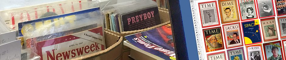
College parodies from Missouri (1937), Yale (1961), Arizona (1955) and Penn State (1928)
(WARNING: The following observations are based on the author’s own haphazard — though extensive — collecting and are informed speculation, not gospel. It is even possible his list of Most Parodied Magazines is imperfect and should include Confidential, Liberty, Mad, National Geographic, Police Gazette, Popular Mechanics, Rolling Stone or Vogue. Further research is called for, as they say in grant proposals.)
What is the most parodied magazine of all time? Playboy thinks it is, but magazine parodies were popular decades before Playboy. The ’20s saw an explosion of “Burlesque Numbers” on campus and in Life and Judge. College mags put out “annual” parody issues — sometimes decades apart — until they fell on hard times in the ’60s everywhere but Cambridge. Newsstand parodies spiked in the early ’30s and boomed in the ’70s and ’80s in the wake of National Lampoon.

New Yorker parodies from Duke (1941), Ohio State (1947), Punch (1954) and Harvard (1976).
Titles from The Harvard Law Review to Strictly Elvis have been spoofed multiple times, but only a few can draw parodists year after year the way a flame draws moths. My own list contains an even dozen, only four of whom are contenders for the Top Spot. In order of appearance (or reappearance after major surgery), the eight runners-up are:
- Ladies’ Home Journal (1883)
- The Saturday Evening Post (revamped 1897)
- Reader’s Digest (1922)
- Esquire (1933)
- TV Guide (1953)
- Sports Illustrated (1954)
- Cosmopolitan (revamped 1964)
- People (1974)
The Journal was the first magazine with one million subscribers; the Post the first with twice that. Their oversize pages were thick with four-color ads and the best illustrations money could buy, which likely made some would-be parodists despair of getting a likeness. Similarly with Esquire, though its risqué content in the ’30s and ’40s led many collegians to plunge ahead regardless. Spoofing the Digest or TV Guide in normal-sized magazines posed an unwelcome choice: Print the parody separately (expensive), or run it sideways, two-up (awkward). SI, Cosmo and People are among the top targets of the past forty years, but they missed all or part of college-parody era.

Playboy parodies from Texas (1956), U. Mass (1964), West Point (1965), and Berkeley (1966).
So who are the top targets? Chronologically, the Four Most Parodied Magazines Ever are:
- Time (1923)
- The New Yorker (1925)
- Life (1936)
- Playboy (1953)
The top twelve share three qualities that appeal to parodists:
Familiarity: It’s no fun imitating something nobody recognizes. All these magazines except The New Yorker and Esquire achieved multi-million circulations, and all except Life and People ran at least sixty years. (People will reach that milestone in 2034; Life’s logo still turns up on newsstand specials.) All are, or were, Top Dogs in their respective categories: There are ten parodies of Time for every one of Newsweek, and the ratio is similar for Playboy over Penthouse and Life over Look.
Personality: Parody thrives on distinctive voices and viewpoints: the tortured syntax and “jeering rancor” of early Timestyle, the folksy certainty and small-town conservatism of Reader’s Digest. A strong personality also keeps a magazine from vanishing up its own genre. There are many parodies of movie, scandal and pulp-fiction mags, for instance, but few target one particular title. (Science-fiction parodies, on the other hand, tend to be very specific.)
Adaptability: A “magazine” was originally a storehouse, and the most parodied can accomodate a huge variety of goods in many sizes. Ten of our twelve could plausibly run a story on any subject, though some would skew it toward a particular demographic; the other two cover television and sports, which barely restricts them. Parodists also favor magazines that run many pieces of varying lengths and styles rather than a few long ones; they’re more likely to tackle the New York Times Book Review than the New York Review of Books. The New Yorker is a partial exception here, but its air of detached, worldly amusement was a model for four decades of college humorists, and the urge to try on Eustace Tilley’s monocle often proved irresistible. It still does, if this summer’s “Nuë Jorker” is any indication.
Despite that, The New Yorker isn’t THE most parodied magazine. Neither is the other third-place contender, Life, though the first full-length parody appeared within months of its debut (the Missouri Showme’s “Strife,” February 1937). Playboy is comfortably ahead of both, but hasn’t inspired a notable parody in the U.S. since “Playbore” and “Playboy: The Parody” fought it out on newsstands in 1983-84. Which leaves Time.

Mock Times from, top row: Annapolis (1928), Harvard’s Advocate (1932) and Lampoon (1941), Dartmouth (1948) and Ohio State (1948); bottom row: Alabama (1952), Davidson (1953),
Punch (1960), National Lampoon (1984) and Emory (1998).
The Penn State Froth’s “Froth Time” of January 1928 is the earliest Time parody I’m aware of. The Navy Log and Yale Record piled on the same year, and in the late ’40s and ’50s parodies of Time popped up on one campus or another almost every month. The Harvard Lampoon issued four between 1941 and 1989. At the other extreme, in 1953 Davidson College’s Scripts ‘n Pranks slimed Time in its only full-length parody ever.
Newsstand mags that have mocked Time include Vanity Fair (in 1933), Ballyhoo, Punch, Esquire and National Lampoon. The New Yorker’s 1936 “Time, Fortune, Life, Luce,” written by Wolcott Gibbs in maliciously heightened Timestyle, is thought to be the most reprinted magazine parody ever. It’s certainly the most quoted: “Backward ran sentences until reeled the mind” supplied the title for a Gibbs anthology only a few years ago. Just recently, Tom Connor and Jim Downey (“re-Wired,” “Is Martha Stuart Living?”) released a 64-page one-shot with “President-Elect” Donald Trump inside the famous red border.
In February 1952, the University of Alabama Rammer Jammer celebrated the school’s centennial with its “first 100% parody issue,” called, appropriately, “Tide.” (One contributor was a junior named Gay Talese.) “We had several national magazines in mind before we struck our colors to Time,” editor Leo Willette wrote. “Though a good portion of our readers had heard of The New Yorker, only about ten percent ever read it with anything approaching regularity…. Comparable shortcoming manifested themselves with Saturday Evening Post, Ladies Home Journal, True, Argosy and most of the spectrum of reading fare. In Time, we assume, the student will find a familiar friend. Then, too, Time (1) has a style not difficult to interpret and copy; [and] (2) gives outlet for a potpourri of short, easily digested chunks of gripes and gags….”
What more could a parodist want — except, maybe, a centerfold? — VCR


 Of all the magazine parodies I’ve heard of but never seen, 1963’s anonymous “Newsweek International Edition” is the most puzzling. Calling it “a vicious piece of propaganda,” the real Newsweek for January 13, 1964, laid out the few facts available: “Purporting to be the Nov. 18, 1963, issue of Newsweek with a cover picture of Sen. Barry Goldwater, the hate pamphlet is a mishmash of doctored photographs and inflammatory captions in French and English, apparently designed to foment race hatred and anti-American sentiment. A number of copies were mailed from Europe, but efforts to track down the publishers and distributors have been unsuccessful.”
 I’m more confident that whoever created this “Newsweek” either hadn’t seen the original recently or assumed potential readers hadn’t. The cover resembles a typical Newsweek from 1949 or ’50, when its lopsided-red-border-and-square-photo format was new and not yet plastered with boxes and banners. Newsweek began stripping away this effluvia in 1961 and by mid-’62 was running full-bleed covers topped only by its underlined name, as in the real November 18, 1963, issue shown here. Whatever his(?) talents as a propagandist, the creator of “Newsweek” was no great shakes as a parodist. — VCR


 Harvey Kurtzman’s “Newspapers!” in Mad #16 is basically a six-page takeoff of the New York Daily News, but it’s preceded by a warning to comic book readers that tabloid journalism’s focus on sex and violence is corrupting American adults. Though clearly a satire of the 1950s anti-comics crusade, Kurtzman’s loathing of the prurience and vulgarity of the tabs is obvious, and his parody is cold-eyed, precise and damning. (So damning, in fact, that it subverts the story’s moral: If comic books are no worse than tabloids like this, maybe they should both be banned.) Even the name “Daily Poop” evokes a not-so-subtle Swiftian revulsion.


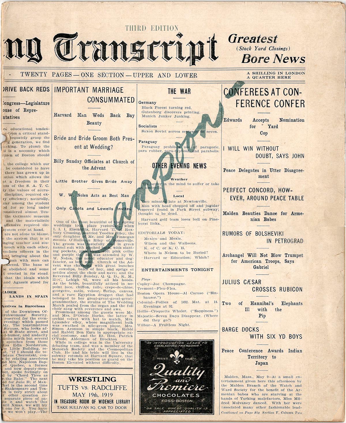
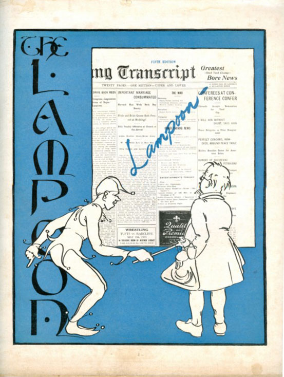
 The Harvard Lampoon may be the source of the “annual” misapprehension. Early on, its parodies really did appear every year: 27 in the quarter-century from 1919 to 1943. (Here’s a

 Aardvark was going to be the humor magazine at Chicago’s Roosevelt University until the Powers That Be saw the first issue. Shut out at home, founders Jeff Begun, Ron Epple and Howard R. Cohen decided to broaden their reach to all the city’s campuses. Aardvark survived for at least 11 issues (the last I know of is Vol. 3, no. 2, from 1964) and at its peak was distributed from Madison to Urbana. Its strengths were sharp writing and smart interviews with humorists including Mort Sahl and Shel Silverstein; its handicaps included cheap paper, sloppy layout and ugly columns of typewriter-font text.


 The Dartmouth Jack-O-Lantern‘s “Nü Yorker,” unlike the Purple Parrot‘s, is all fake and strictly for laughs, from Jerry Lewis’s letter to the editor (“I respectfully request … that neither my social security number, nor a photostat of my birth certificate be reprinted in any subsequent issues”) to the caption contest featuring Jacko‘s favorite running gag, “Stockman’s Dogs” (two canines drawn in 1934 and present in nearly every issue since). Notably funny pieces include “Letter From A Truck Stop Outside Neola, NE: This Place Sucks”; a deranged “Profile” of a poor guy named Jack Napier who can’t convince the author he’s not the Joker; and a wonderfully pretentious poem, “Skipping Cultural Stones on the Sea of Aspersions.”